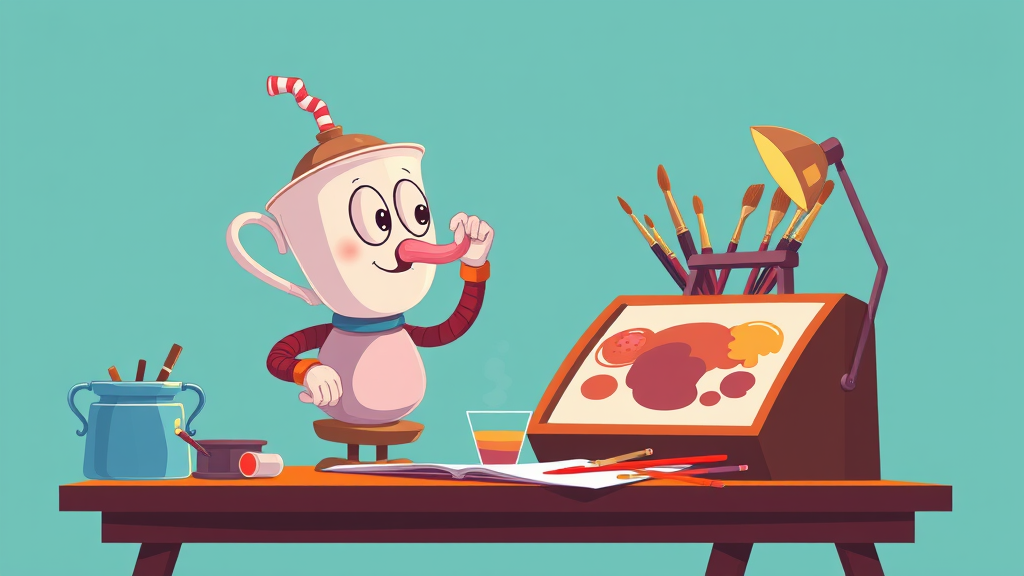
Nine years after launch, people are still arguing about Cuphead's visuals, and honestly that tells you more than any review could. Most games chase photorealism and get forgotten inside a year. Cuphead drew its whole world by hand, in ink, in the style of 1930s rubber-hose animation, and it has never left the conversation.
Studio MDHR did a thing that sounds simple until you sit with the production reality. Every frame of animation was drawn and inked by hand, the same way Fleischer and early Disney cartoons were made. No rigging, no procedural tweening, no shortcuts. The Moldenhauer brothers, Chad and Jared, spent years in development, reworking assets across delay after delay chasing the film-reel look they grew up obsessed with. I'd argue all that obsessive polish made the final game tighter. No filler.
Remember what the graphical conversation looked like that year? Horizon Zero Dawn had just shown what foliage density could do for an open world. Everybody was counting polygons and fighting about checkerboard rendering on PS4 Pro. Then Cuphead arrives in September 2017 looking like a film strip pulled out of a 1934 theater vault, film grain, frame imperfections, title cards and all, and it ran circles around games with a hundred times its budget on pure memorability. People couldn't screenshot it fast enough.
The funny part is the technical trick was that there basically wasn't one. Modern shading and particle effects sat layered under the hand-drawn art, but the identity came from craft, not tech. Backgrounds were hand-painted in the style of '30s theatrical cartoons. Character animation ran on ones and twos the way real cel animation does, which is why movement feels slightly jumpy in a way that reads as authentic instead of cheap. Same reason old Disney shorts still feel alive. When you watch Cuphead's mermaid boss or the devil's final phase, you're watching drawing. Period.
The reach kept growing too. The game hit Switch in 2019, then PlayStation 4 in 2020, and that mattered more than it sounds. Cuphead started as an Xbox and PC exclusive, one of the early standard-bearers for Microsoft's indie push, and ended up on every platform that could run it. Not many exclusives break containment that completely. The Delicious Last Course DLC in 2022 added a new character and a stack of bosses in the same style, with animation volume that would make most studios flinch.
The influence shows up in places you might not expect. After Cuphead, studios started pitching stylized 2D art as a deliberate commercial identity rather than a budget constraint. You can draw a straight line from it to the wave of games leaning on a single visual conceit, whether that's papercraft, crayon, or stop-motion textures. The lesson the industry took was that a committed art style ages slower than cutting-edge rendering. Nobody looks at Cuphead in 2026 and calls it dated. Can't say that about most of the 2017 tech showpieces, and I say that as someone who loved them at the time.
There's an older precedent worth naming here, because this is the part younger players miss. Hand-drawn games existed before Cuphead. The Wonder Boy and Monster World games were painterly back on the Genesis, and Treasure's Alien Soldier had more animation frames than the physics had any right to allow. Street Fighter III's hand-drawn sprites in '97 cost so much they arguably helped kill the 2D fighting game for a decade. What Cuphead proved is that the approach could be a headline instead of a limitation, that the art itself could be the reason a game breaks out and stays broken out.
The boss of it all is that Cuphead succeeded by refusing every efficiency the last thirty years of game development built. No engine trick replaced a pencil. If you haven't touched it since the 2017 run, the Switch and PS4 versions are dirt cheap now and still look like nothing else on the shelf. Nine years on, that's the legacy: the game that made hand-drawn the point instead of the compromise.
Comments (0)
Log in or sign up to join the conversation.
No comments yet. Be the first.